top of page

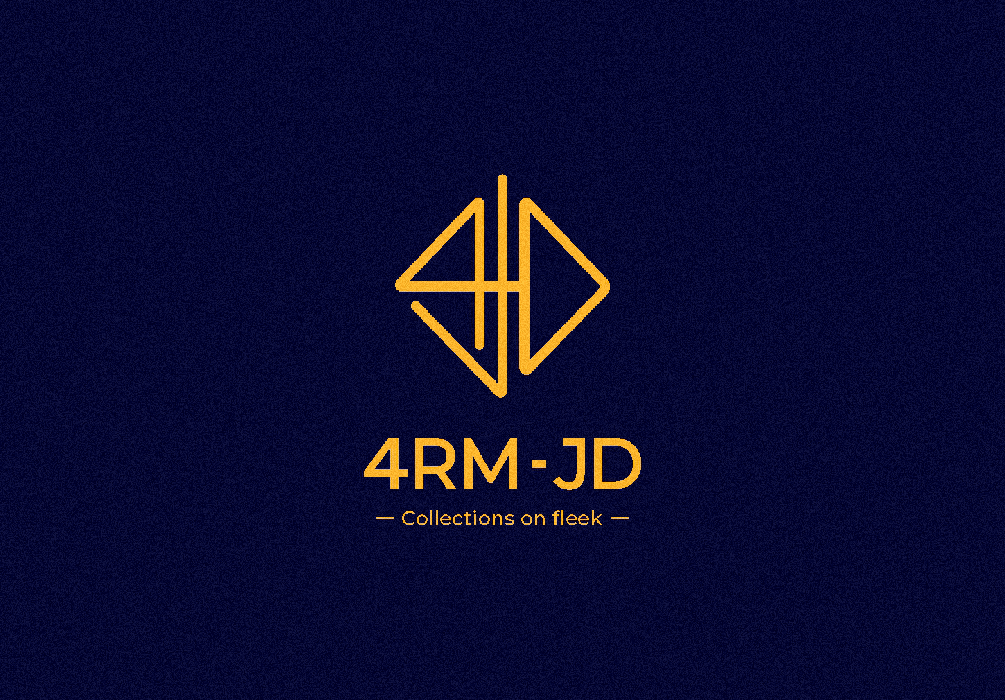
4RM-JD
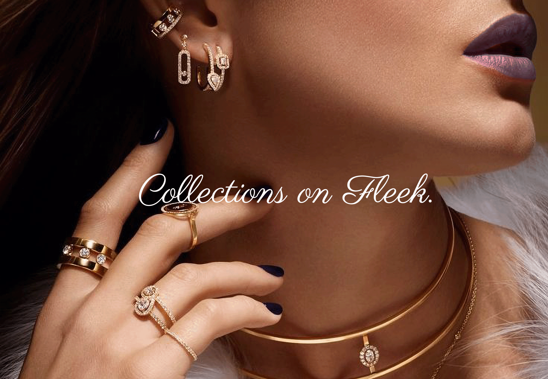
Collections on fleek
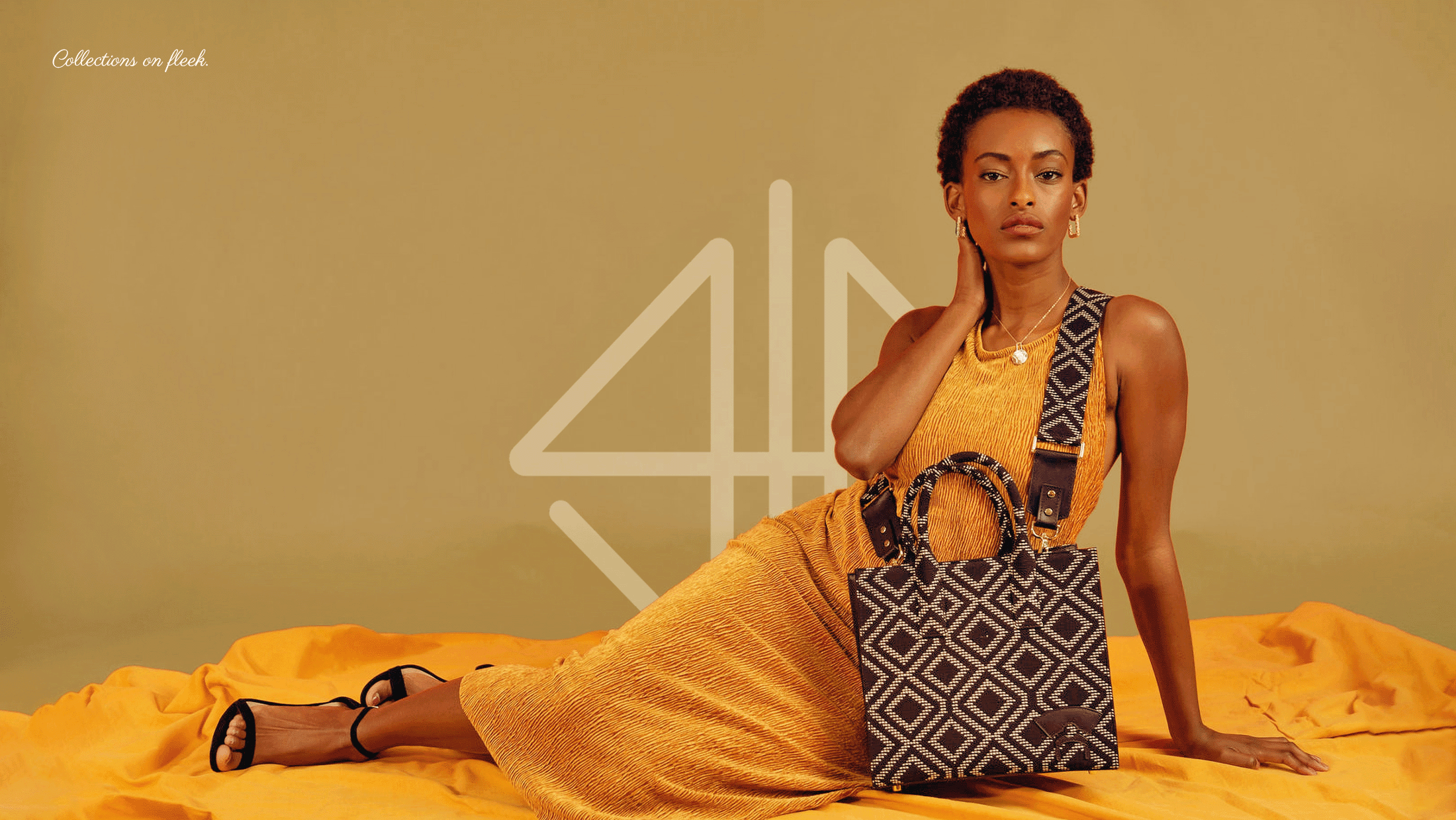
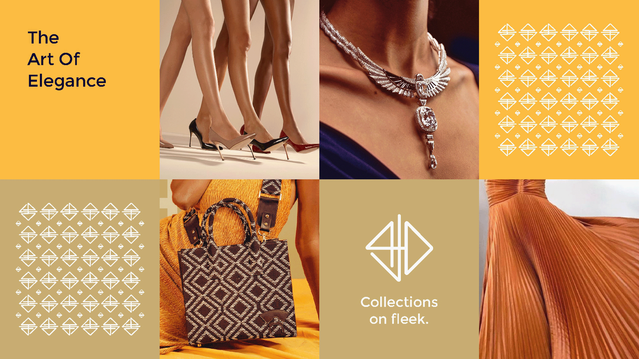
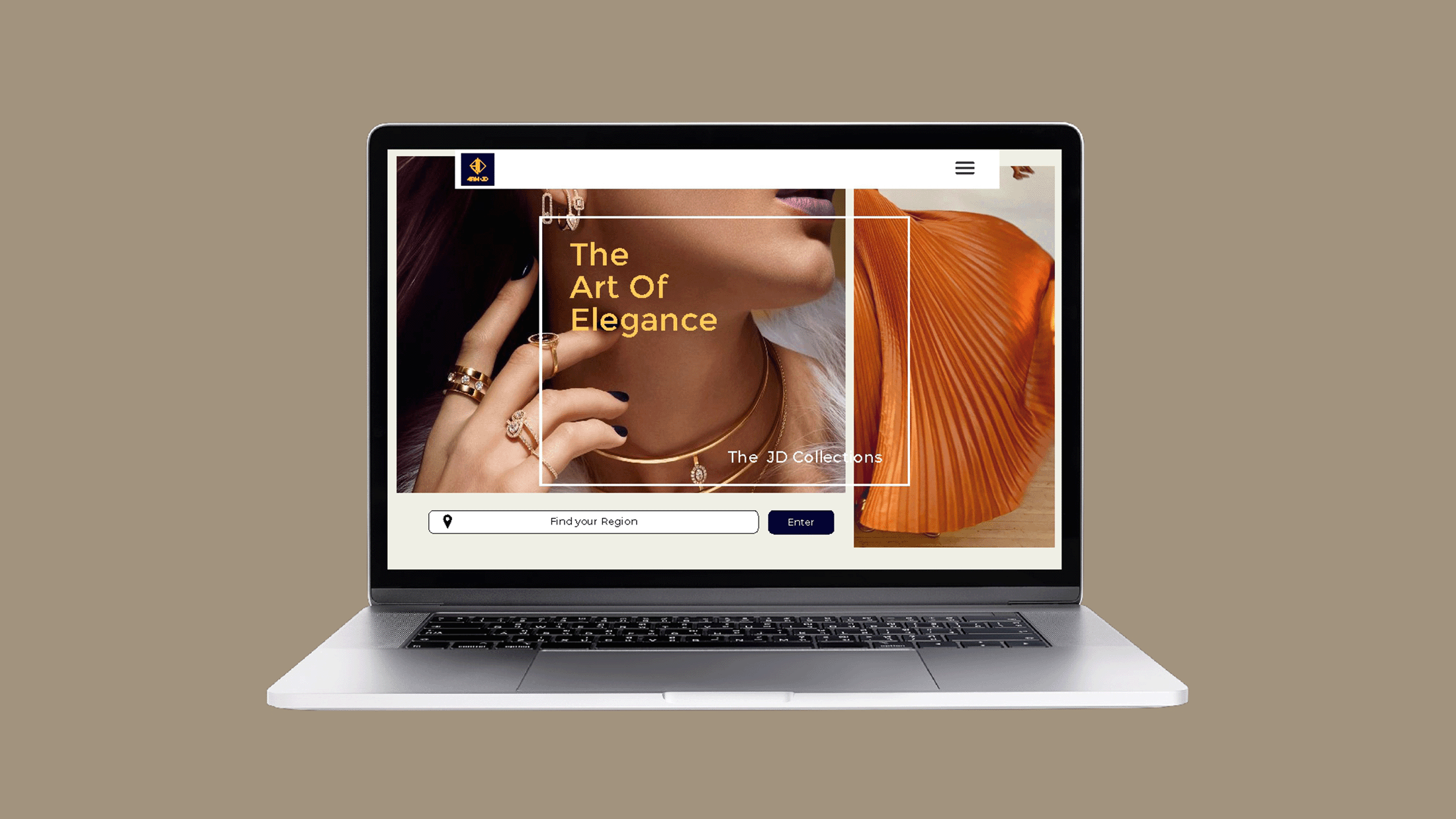
4rm-JD literally from JD is a new jewelry brand, that deals also in apparels and acessories. It collects male furnishings if and when requested, but caters majorly to the female gender. The challenge was to create an identity that captures the female nature and style, at the same time it was important that it appeal to the male gender too 'at leas't. I have created an identity that is both slender (largely appealing to the female audience) and rigid in structure appealing to the male audience in a very subtle way. I have used straight lines majorly, using curves almost unnoticably. Below is a case study.
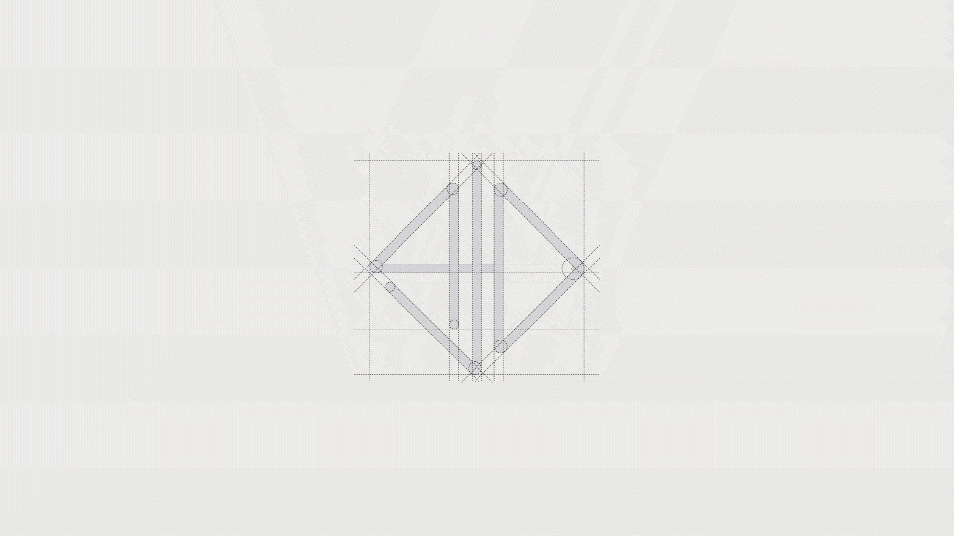
The identity turns the alphanumeric 4JD, (which are also form the initials of the brand) into a classic shape that represents a finely cut stone, or an elegant piece of jewelry. The identity is set in vivid and contrasting colors, and combined with a simple & modern sans serif.

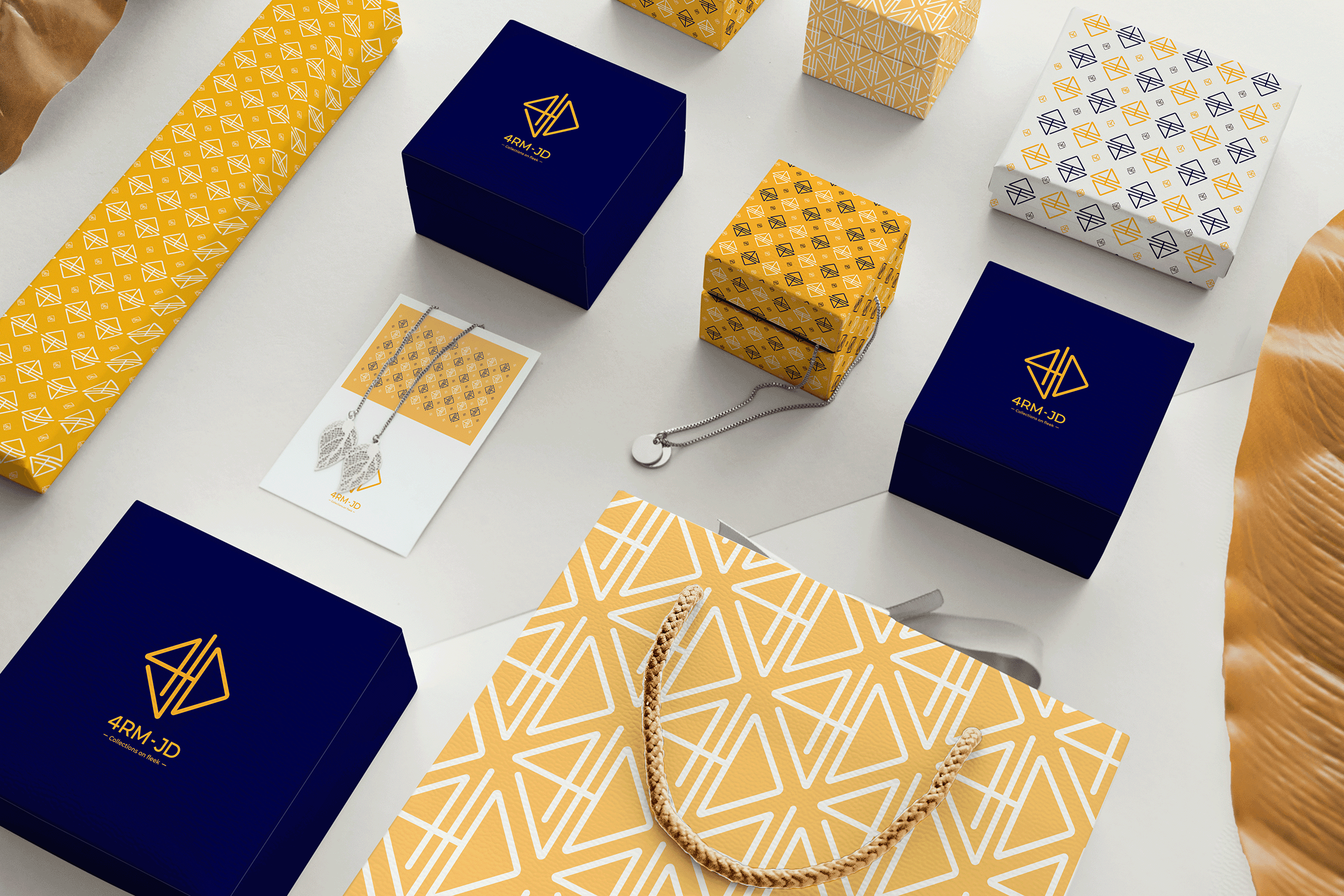
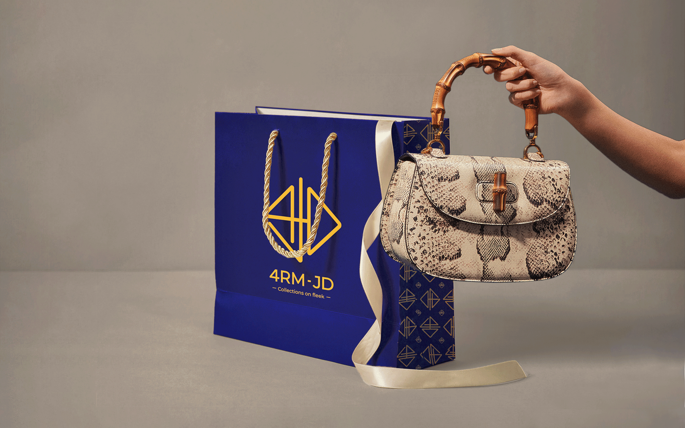
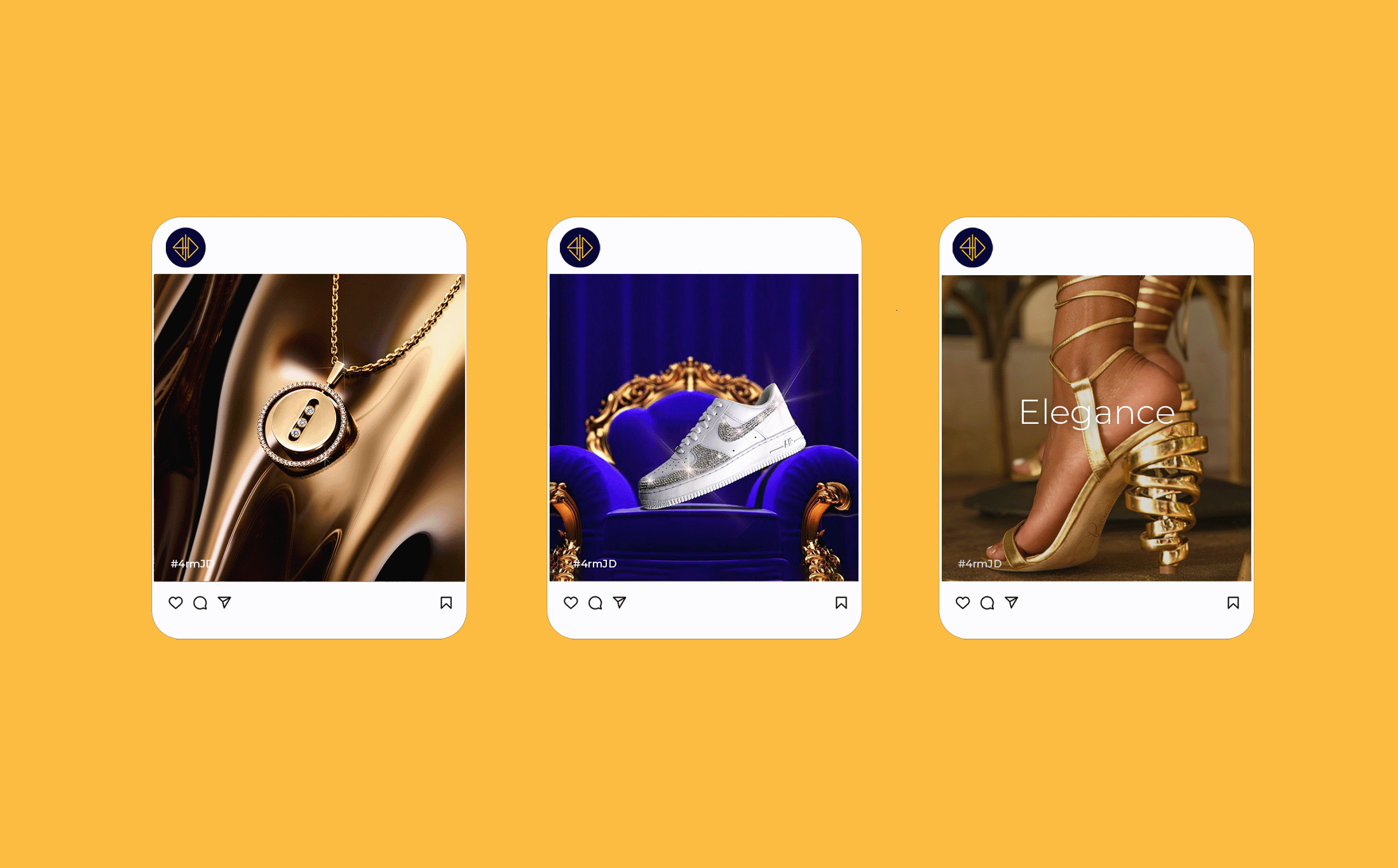
The Elegant packaging for the collection combines both minimalism and maximalism. alongside being elegant, it offers a fun and exciting view into the world of the collections brand.


bottom of page